Landing Page Content Conversion: How to Write Copy That Actually Converts
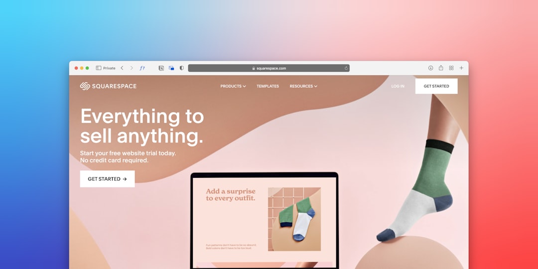
Landing page content conversion hinges on one thing most marketers overlook: the gap between what brought someone to your page and what your page actually says to them. You can nail your keyword targeting, run a brilliant ad campaign, and drive thousands of visitors — but if your landing page copy doesn’t align with visitor intent, speak to a specific problem, and guide someone toward a clear decision, those visitors leave. They just leave. The disconnect between traffic-focused content and conversion-focused content is where most landing pages silently bleed money.
This isn’t about writing prettier sentences. It’s about building a system where every line of copy earns the next scroll, reduces a specific doubt, and makes your CTA feel inevitable.
Why Most Landing Pages Get Traffic but Fail at Conversion
Here’s a pattern that plays out constantly: a team spends weeks optimizing for search rankings or refining ad targeting, then drops visitors onto a page that reads like a product spec sheet. Traffic goes up. Conversion rate sits at 2%. Everyone blames the offer or the audience. Almost nobody looks at the words on the page.
The Gap Between Attracting Clicks and Earning Action
Content optimized purely for search engines tends to answer questions broadly. Content written for ads tends to lean on hype. Neither approach does what a landing page actually needs to do — take a person who arrived with a specific intent and move them, in the span of a single page, from curiosity to commitment.
Visitors bounce for predictable reasons:
- The headline doesn’t match the promise that got them to click
- The copy talks about the company instead of the visitor’s problem
- There’s no clear path from “I’m interested” to “here’s what I do next”
- The page tries to serve five different audiences at once
According to Unbounce’s conversion benchmark report, the median landing page conversion rate across industries sits around 4.3%. The top 25% of pages convert at 5.31% or higher. The difference between median and top-performing pages is rarely design. It’s almost always the copy.
What Conversion-Ready Content Actually Looks Like
A page built for landing page content conversion has a few non-negotiable traits:
- A clear value proposition above the fold. Within five seconds, a visitor knows what you offer, who it’s for, and why it matters to them.
- Benefit-driven copy, not feature lists. Features describe your product. Benefits describe the visitor’s life after they use it.
- Friction-reducing elements placed where doubt naturally arises. Testimonials, guarantees, and trust badges aren’t decorative — they answer unspoken objections.
- A single focused CTA. One page, one goal. Not three buttons leading to three different outcomes.
Contrast this with the typical landing page: a hero image with a vague tagline (“Innovative Solutions for Modern Teams”), a wall of features nobody asked about, three competing CTAs, and a testimonial buried below the fold where 70% of visitors never scroll.
The Anatomy of High-Converting Landing Page Copy
This is where CRO content writing gets practical. Every section of your landing page has a job. If a section doesn’t advance the visitor toward your CTA, it’s dead weight.
Headlines That Match Visitor Intent and Stop the Scroll
Your headline is a handshake. It either confirms “you’re in the right place” or it doesn’t. The single most important principle in conversion copywriting for landing pages is message match — your headline should mirror the language and promise from whatever brought the visitor to your page.
If your ad says “Cut your onboarding time in half,” your landing page headline shouldn’t say “Welcome to Our Platform.” It should say something like “Cut New Hire Onboarding from 3 Weeks to 3 Days.”
A few before/after examples:
| Before (Vague) | After (Specific + Intent-Matched) |
|---|---|
| “The Smart Way to Manage Projects” | “Stop Losing Tasks Between Slack and Email — Manage Every Project in One View” |
| “Affordable Marketing Services” | “Get a Full Marketing Team for Less Than One In-House Hire” |
| “Try Our Software Free” | “Build Your First Automated Workflow in 10 Minutes — No Credit Card Needed” |
Notice the pattern. The stronger versions name a specific pain, quantify something, or describe an outcome the visitor actually wants. Specificity beats cleverness every time.
Structuring Body Copy Around One Core Promise
A landing page is not a homepage. It’s not a blog post. It serves one audience segment with one offer, and the body copy should orbit a single value proposition like a gravitational center.
Two frameworks work exceptionally well here:
PAS (Problem–Agitation–Solution): Name the problem your visitor faces. Agitate it — make them feel the cost of inaction. Then present your offer as the resolution. This works especially well for pain-driven offers (fixing something broken, eliminating a frustration).
AIDA (Attention–Interest–Desire–Action): Grab attention with the headline, build interest with relevant details, create desire through benefits and proof, then direct action with your CTA. This framework suits aspiration-driven offers (achieving a goal, gaining a new capability).
Whichever structure you choose, ruthlessly cut anything that doesn’t serve the core promise. That paragraph about your company’s founding story? Unless it directly builds credibility for this specific offer, it’s gone. The bulleted list of 14 features? Trim it to the three that matter most to this audience.
Clarity converts. Cleverness entertains. Know which one you’re writing.
Social Proof, Objection Handling, and Trust Signals
Most landing pages treat testimonials like garnish — a quote dropped at the bottom of the page, disconnected from the argument the copy is making. That’s a waste.
Social proof works best when it’s placed at the moment of doubt. Right after you make a bold claim, back it with a customer quote that validates it. Right before your CTA, place a trust signal that reduces the perceived risk of clicking.
Here’s a practical hierarchy:
- Testimonials with specific results (“We increased demo bookings by 34% in the first month”) outperform generic praise (“Great product, highly recommend!”).
- Case study snippets — a two-sentence summary with a link to the full story — give curious visitors a path to deeper validation.
- Trust badges and guarantees (money-back guarantees, security certifications, “no credit card required”) reduce friction at the point of commitment.
- Logos of recognizable clients or media mentions provide instant credibility, especially for B2B pages.
Place these elements within the content flow, not in a separate “Testimonials” section that visitors may never reach. A testimonial that appears right after you explain your pricing is worth ten times more than one sitting in a carousel at the bottom of the page.
Writing CTAs That Feel Like the Natural Next Step
“Submit.” “Buy Now.” “Click Here.”
These are not CTAs. They’re commands. And they describe what the business wants, not what the visitor gets.
Effective CTA copy completes this sentence in the visitor’s mind: “I want to ___.” That means your button text should reflect the value on the other side of the click.
Strong CTA examples:
- “Start My Free Trial” (not “Sign Up”)
- “Get My Custom Quote” (not “Request Quote”)
- “See How It Works” (not “Learn More”)
- “Send Me the Playbook” (not “Download”)
Placement matters too. Your primary CTA should appear above the fold and repeat after key persuasive sections — after your strongest benefit statement, after social proof, and at the bottom of the page. A study by ContentVerve found that CTA placement aligned with the visitor’s decision readiness outperformed fixed-position buttons by significant margins.
One more thing: the text surrounding your CTA button matters as much as the button itself. A single line of microcopy underneath — “No credit card required. Cancel anytime.” — can lift conversion rates by reducing last-second hesitation.
Landing Page Optimization Content: Testing and Refining What You Write
Writing great copy is half the job. The other half is treating your landing page like a living document — one that gets smarter with every round of data.
Which Content Elements to A/B Test First
Not all tests are created equal. If you’re testing button colors while your headline is confusing visitors, you’re optimizing in the wrong order.
Testing hierarchy for landing page optimization content:
- Headline and subheadline — highest impact on first impressions and bounce rate
- CTA copy and placement — directly tied to conversion action
- Value proposition framing — how you describe the core benefit
- Social proof type and placement — which proof elements reduce friction most
- Page length and content density — how much copy your audience actually needs
- Visual and design elements — layout, imagery, color (test these last)
Run one test at a time. Give each test enough traffic to reach statistical significance — most CRO experts recommend at least 1,000 visitors per variation before drawing conclusions. And document everything. Your testing log becomes your most valuable marketing asset over time.
Reading Heatmaps and Scroll Data to Diagnose Content Problems
Analytics tell you what happened. Behavioral data tells you where it went wrong.
Tools like Hotjar and Microsoft Clarity show you:
- Scroll depth maps — where visitors stop scrolling. If 60% of visitors never reach your CTA, the content above it isn’t compelling enough to earn the next scroll.
- Click maps — what visitors click (and what they try to click but can’t). Non-linked elements getting clicks? That’s a signal to make them interactive or clearer.
- Session recordings — watch real visitors navigate your page. You’ll spot confusion, rage clicks, and abandonment patterns no dashboard can reveal.
When you identify a weak section — say, a feature block where scroll velocity spikes (meaning visitors scroll past it quickly) — that’s your rewrite target. Don’t guess. Let the data point you to the content that’s losing people.
Segmenting Content by Traffic Source for Higher Relevance
A visitor from a Google search for “best project management tool for agencies” has different expectations than someone who clicked a Facebook ad about team productivity. Sending them both to the same page with the same copy is a compromise that hurts conversion for everyone.
Practical segmentation approaches:
- Dynamic text replacement (DTR) swaps headline or subheadline copy based on the search query or UTM parameters. Someone searching “affordable CRM” sees “Affordable CRM” in the headline; someone searching “CRM for small teams” sees that phrase instead.
- Source-specific landing pages — build separate pages for paid search, social ads, email campaigns, and organic traffic. The core offer stays the same; the framing and emphasis shift.
- Awareness-level matching — cold traffic from social ads needs more education and trust-building. Warm traffic from email needs less convincing and more urgency.
This isn’t about creating dozens of pages. Even two or three variations — one for cold traffic, one for warm — can meaningfully lift your overall conversion rate.
If you’re just getting started with content strategy, our Welcome page walks through foundational concepts that apply here too.
Frequently Asked Questions About Conversion Copywriting for Landing Pages
How Long Should Landing Page Content Be for Maximum Conversions?
It depends on two factors: how aware your audience is and how complex your offer is.
- Short-form (300–500 words): Best for warm audiences who already know you, simple/low-cost offers, or pages where the traffic source (like email) has already done the persuasion work.
- Medium-form (500–1,500 words): Works for mid-funnel prospects evaluating options. Enough room for a clear value proposition, key benefits, social proof, and a CTA.
- Long-form (1,500+ words): Necessary for cold traffic, high-ticket offers, or complex products where visitors need significant education before committing.
The rule of thumb: your page should be exactly as long as it needs to be to answer every question standing between the visitor and the CTA. Not one sentence longer.
Should I Write Differently for Mobile Landing Pages?
Yes. Statista reports that mobile devices generate approximately 59% of global web traffic, and for paid social campaigns, that number skews even higher.
Mobile conversion copywriting means:
- Shorter paragraphs (2–3 sentences max)
- Front-loaded value propositions — put the most important information first
- Thumb-friendly CTA buttons with generous tap targets
- Scannable formatting: bold key phrases, use bullet points, break up text with subheadings
- Eliminate any element that doesn’t earn its screen space
What Is the Biggest Mistake in CRO Content Writing?
Writing about your product instead of your visitor’s problem. The most common conversion killer is copy that starts with “We” and “Our” instead of “You” and “Your.” Visitors don’t care about your mission statement. They care about whether you can solve their problem faster, cheaper, or better than doing nothing.
Audit your page right now. Count how many sentences start with “We” versus “You.” If “We” wins, rewrite.
How Often Should I Update My Landing Page Copy?
Review performance data monthly. If your conversion rate has plateaued for 4–6 weeks, it’s time to test new copy variations. Other triggers for a rewrite:
- Traffic sources change (new ad campaigns, seasonal shifts)
- Your audience’s language or priorities evolve
- Competitors shift their positioning
- You have new social proof or case studies to incorporate
Can SEO and Conversion Copywriting Coexist on the Same Page?
Absolutely — but on a landing page, conversion takes priority. Integrate keywords naturally into your headline, subheadings, and body copy. Use semantic variations rather than repeating the exact phrase. If a keyword insertion makes a sentence awkward or dilutes the persuasive message, drop it.
Search engines increasingly reward pages that satisfy user intent, and a page that converts well is, by definition, satisfying intent. You can review our Terms for more on how we approach content standards.
Do Videos and Images Replace the Need for Strong Written Content?
No. Visual elements enhance engagement and can demonstrate products in ways text can’t, but the written copy does the persuasive heavy lifting. A video can show your product in action; the copy frames why that matters to this specific visitor. Pages with strong copy plus supporting visuals consistently outperform pages that rely on media alone.
Think of it this way: if someone watches your video on mute (and many do, especially on mobile), the surrounding copy needs to carry the full argument.
How Do I Know If My Landing Page Content Is the Problem vs. My Offer?
Start with content changes — they’re faster and cheaper to test. If you rewrite your headline, restructure your copy, add stronger social proof, and refine your CTA but conversion rates still don’t budge after sufficient traffic, the offer itself likely needs repositioning.
Qualitative feedback accelerates this diagnosis. Run a five-second test (show someone the page for five seconds, then ask what it offers). Send a post-visit survey to non-converters. Watch session recordings. If visitors understand the offer but still don’t convert, the problem is probably the offer. If they seem confused or disengage early, it’s the content.
Stop Rewriting Headlines — Start Rewriting Your Approach
Tweaking a headline in isolation won’t fix a page that lacks persuasive structure. Landing page content conversion is a system: intent-matched messaging, benefit-driven copy, strategically placed proof, and a CTA that feels like the obvious next step — all refined through ongoing testing.
Here’s your action plan:
- Pick your highest-traffic landing page. Pull up the analytics and behavioral data.
- Audit it against the frameworks above. Does the headline match the traffic source’s promise? Is the body copy organized around one value proposition? Is social proof placed at moments of doubt?
- Identify the single weakest content element and rewrite it first.
- Run the test for at least two weeks or until you hit statistical significance.
- Document the result and move to the next element.
One page. One element at a time. Compounded over months, this approach transforms conversion rates in ways that no single headline swap ever could.
References
- Unbounce. “Average Conversion Rates for Landing Pages.” unbounce.com
- Statista. “Share of Website Traffic from Mobile Devices.” statista.com
- CXL Institute. “A/B Testing Statistics.” cxl.com